Modernise Microsoft product key redemption experience
Rethink Setup.office.com by simplifying redemption journey and enable growth initiatives.
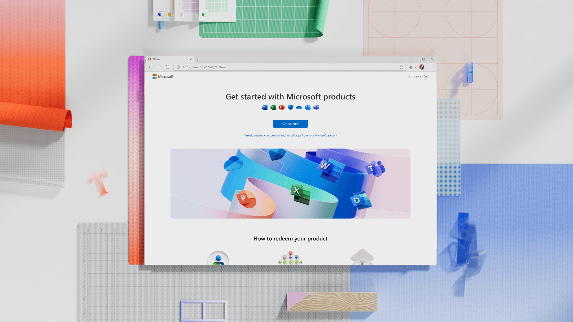
Some context
Initially Microsoft sold Office products by selling DVDs that will be installed on one single machine.
In 2013, Microsoft moved to a digital distribution system, selling 16 digits product key that can be redeemed online on setup.office.com.
This was the channel I was asked to rethink, in order to make it more flexible, modern and adapt to experiment and drive growth.



Where things were at
Product was released in 2013 and updated marginally along years, reaching an average traffic of ~3.5M users/month and a growing 30% of abandonment rate, meaning that customer that already purchased their product gave up in the process of redeeming them, causing a low satisfaction rate in the customer experience.
~3.5 M
Monthly visitors
17.4%
Abandonment rate
What users were saying
Additionally, preliminary user research through the feedback evaluation form revealed that users struggles to redeem their product key due to the unclear pattern and high latency. Specifically users called out struggles with understanding why they cannot change the country and cannot download their product once the flow was completed.


Frustration for having auto-renew turned on by default


Struggle to understand the location of their product


Lack of understanding on how to download the products
Goals
The modernisation aimed to rethink the end-to-end experience by focusing on 3 key steps:
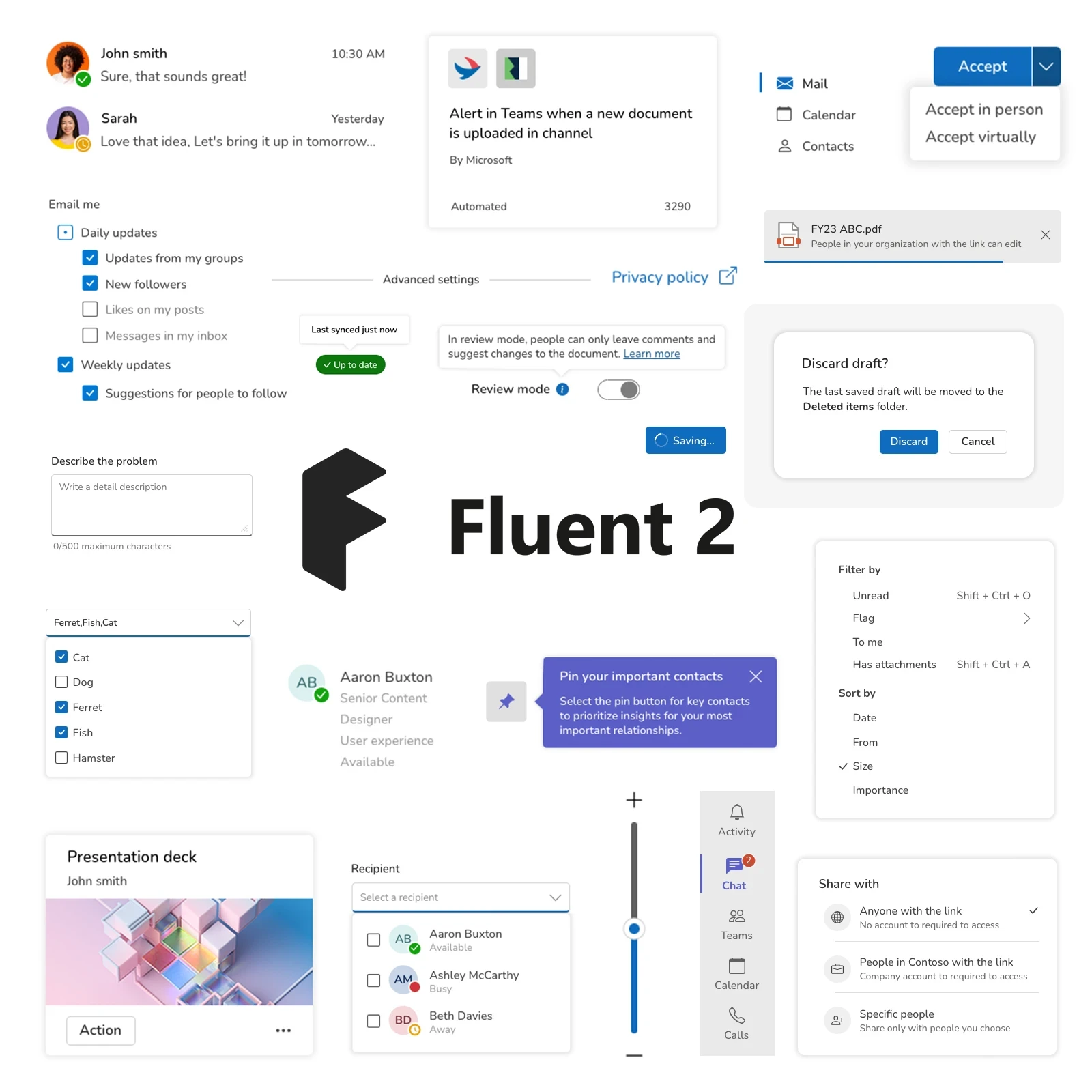

To create a consistent user experience and enhance legitimacy, I utilized the flexible growth framework and versatile components from Office Checkout, a design system I contributed to, designed for transactional interfaces.
This framework was designed to promote consistency across all channels, establish legitimacy through Fluent design alignment, and provide comprehensive coverage throughout the entire flow—resulting in a cohesive system that delivers a seamless user journey.
Enhance usability by streamlining the journey
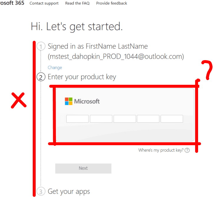
To simplify the core flow, I've opted to move away from the stepper process, and instead focus the experience focus on one card and a linear navigation, always allowing users to move back and forth between the steps.
This new pattern allowed to:
Enhanced clarity regarding user actions, both current and upcoming
Increased flexibility across the user journey by breaking the process into individual pages, allowing steps to be added or removed based on the product.

First draft of redefined flow
After defining the foundational UX, I started exploring clear and effective ways to present information on the screen — focusing on helping users easily understand:
How to redeem their product and what exactly they’re redeeming
The benefits of auto-renew and how to enable it
How to download their app
To assess the flow, I organised a workshop showcasing all possible variants of each screen. Together with the PMs and designers, we walked through the journey to review, refine, and iterate on both the flow and the components used.


Workshop focused on core flow imporovements and UI variants
Optimize the core redemption journey
To simplify the core redemption journey, I consolidated the fragmented interactions into a single card, making the steps clear and highlighting the main action.
I also needed to make the stepper navigation more flexible, since the flow could range from 2 to 5 steps. Displaying all steps upfront limited this flexibility. To solve this, I preserved the stepper logic but redesigned it as a simple string in the top-right corner, showing the current step without locking in a fixed number.
Finally, I refined the navigation by placing it closer to the input field and making it linear. This allows users to move easily back and forth through the flow while always knowing where they are and how to continue.
Clarify what users were redeeming
The redemption flow wasn’t clear about which product was being redeemed, especially regarding the associated location. The auto-renew toggle on the same page as the product key also distracted users from their next action.
To address this, I focused on two goals: provide more information and separate the product confirmation page from the auto-renew page.
I created a component to bridge the two pages and clearly display the product details:
Product image
App icons and description
Region tied to the product key
The region, previously a selectable option, now shows the single country linked to the key, with a tooltip explaining what to do if the country is incorrect. This component can then carry over to the next step, giving users consistent reassurance about the product they’re redeeming.
Evolution of Product confirmation page
Increase auto-renew rate by promoting benefit
The main business goal behind this redesign was to convert one-time customers into recurring ones. To achieve that, users needed to enable auto-renew and add a payment card to their account.
The challenge, however, was communicating clearly that users wouldn’t be charged immediately — the card was only required to set up billing.
To address this, I explored alternative patterns beyond a simple toggle, focusing on designs that clearly highlighted the benefits of enabling auto-renew versus leaving it off.
Evolution of auto-renew page
Make adding a payment method clearer
Once the auto-renew setup was addressed, it was important to clearly show its value while reassuring users that they wouldn’t be charged immediately and that the product they were redeeming was still theirs. Previously, users were redirected to add a credit card without realising the redemption was still in progress, leading to drop-offs.
The payment step also needed flexibility—users should be able to select alternative methods, provide extra information, or complete second-factor authentication.
Rather than placing the payment form directly on the page, I implemented a modal overlay. This preserves the redemption context, allows users to dismiss the step if needed, and provides the flexibility for a smooth, reassuring experience.
Payment method selection flow
Create a clear download path
To address users’ uncertainty about where to download the product, I added a final page that celebrates the success of the redemption process and provides a clear path to download their apps.
Updated final steps of redemption journey
Impact
The updated product launched in February 2024 and delivered immediate results, achieving a 14% reduction in abandonment rate in the first month thanks to the streamlined user journey, and driving $9M in annual revenue growth through increased auto-renew activations.
Impact
+$9M
Annual revenue
+14%
Reduction in abandonment rate
End-to-end redemption journey
What's next?
Thanks to this modernization, we were able to begin running growth experiments across different parts of the journey. This allowed us to both learn and refine our understanding of customer preferences, while also testing more compelling offers—such as bundles—that encouraged users to add a payment method and increase the auto-renew rate.


Are you still courius?
