All utilities, simplified at a glance
Simplifying and centralising utilities in one intuitive, mobile-first experience for consumers and businesses.

Where things were at
3 different touch points have to be match in one app
Long time to deploy updates to the main system
No direct channel to share offers and communication with customers

Web portal for utilities management

Website for loyalty program
What users were saying
To make the service more intuitive and user-friendly, I interviewed customers to understand the challenges they were facing and the improvements they wanted to see.
Users reported difficulties finding key information such as bills, payment options, consumption data, account numbers, and plan details. Many also expressed frustration at having to visit two separate websites to check their gas and electricity usage.
Finally, several users complained about the ticketing system, citing confusion around ticket status, ownership, and the next steps toward resolution.
“I just want to see if I need to pay”
“I don't know how how switching is going"
“I've spent 13 minutes looking for my last bill”
“I'd like to have electricity and gas utilities in one place”


Some examples from the research deck illustrating key user needs and primary mental models
UX goals
Once understood and tracked services structure, I started defining user flows and information architecture for the new product with 3 key goals:
Simplify the access and management of utilities
Increase discoverability of key information
Make the app feel modern and intuitive to use
First, I worked on simplifying the process of managing utilities by creating a single central page that brings together both electricity and gas services. This page connects all relevant information in one place, eliminating the need to navigate through multiple layers of subpages.

Set up frequent and live collaboration between teams and discipline
With project managers, product owners, and the other stakeholders I defined a 2 weeks Sprint process with continuous feedback and iterations.
I mapped and estimated all app sections and split them into Sprint. This roadmap allowed us to follow the progress and adapt project needs to timing and contingency, moving the section from one Sprint to another.


Start from what is already known
At the start of each sprint, I defined the functionality to be discussed and defined a user story to focus the conversation on a specific flow.
I also incorporated research insights, such as user needs and mental models, to ensure that product decisions were aligned with user expectations.

Map what's live today
I mapped each functionality flow based on the defined user story, highlighting current pain points, showing what users are familiar with today, and illustrating how the back-end structures the information.

Current flow to check their consumption and meter readings

Current flow to file a ticket (mobile and web)
Keep stakeholder aligned on design choices
For each functionality, I presented the initial drafts and design drafts to stakeholders from the three involved units: Development, Business, and Marketing.
I showcased the UX proposals and facilitated discussions to reach a shared agreement, clarify technical constraints, address business requirements, and ensure alignment with the brand identity directly in the live session, assuring transparent communication and effective alignment.


Feedback matrix for design review
Start building a consistent design language
During the Sprint session, in parallel to the creation of the first wireframes, I've started working on a design system and design language that will reflect the branding guidelines and will make the app feel modern and friendly.
Once the design system was in a good enough state I've started creating the screens directly in high-fidelity, speeding up the hand-over process of approval from stakeholder and hand-over to engineers.

Some UI explorations
Design system designed consistently with brand guidelines
Iterate on design based on feedback from stakeholder
After the first review of the initial draft, I reviewed stakeholders’ feedback and iterate the design, in order to present an updated version to the next session, this time including a UI implementation to give a more realistic sense of the final experience.
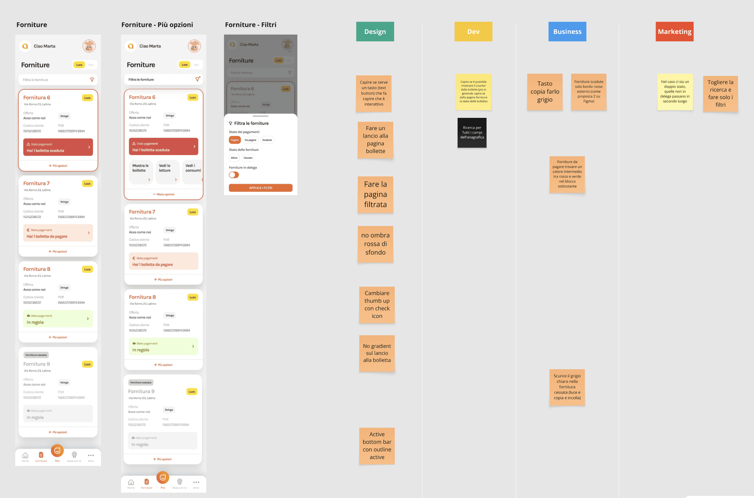
Intermediate iteration of the utilities page list
Increase discoverability of key information
Once the core pattern was approved by stakeholders, I began defining what information to display and how to present it in an intuitive way, ensuring that all key details are accessible at a glance within the app.
Redesigned journey to check utility consumption and pay bills
Following this collaboration method I've been able to address each functionality and reach an approved solution by every team, leaving the homepage last. Now that all modules are defined, the teams can more easily align on what are the most important information to display at first.
Even though each team wanted to include their modules on the homepage, I recommended keeping all key information visible in the first viewport, so users can quickly see an overview of their tools.
This decision was supported by the user research we conducted earlier.

Homepage iterations
Finalised Homepage
Impact
Thanks to the centralized app, the company has saved an average of 12% in time when deploying updates and communicating with customers, eliminating the need to update each channel manually.
In addition, the app was downloaded over 5,000 times in its first week, with 98% of customers successfully migrating from the web platform.
+12%
Saved deploy time
98%
Customers migrated from web platform
Live coded product
Are you still courius?
